Welcome

Welcome to my blog where I randomly talk about Good Things That Make Designing More Fun. Enjoy it and leave a suggestion or a comment or two.

Search This Blog

Tuesday, July 10, 2012

another marker I am growing more fond of daily

I have had a love affair with markers for a long time. I am somewhat loyal. Somewhat.

I started out with Design Markers in college (they are no longer available but I have a few that still have some juice), then moved on to Chartpak AD Markers, and I still like them -- as well as the awesome Copic Markers. I admit to never really liking Prismacolor Markers. Not sure why. I will think on that.

Another marker I am coming to appreciate is the Faber-Castell Pitt (Big Brush) Pens. The colors are a bit limited but the brush style nib is awesome and the color goes down clean and smooth. It feels good in your hand too -- not too skinny or too thick. Their shorter length makes them easier to pack and carry to charrettes and such.

The same colors are available in a smaller pen with a brush style nib too -- for more detailed work with the same colors.

They also make more technical pens (S, F, M, B) in three colors: black, sanguine (reddish) and sepia (brownish).

All in all, this is a very versatile family of pens and markers. Try them!

Tuesday, April 5, 2011

a big honking marker !!

It has been a while since I posted anything but this is worth breaking the silence.

Sharpies are awesome. No doubt.

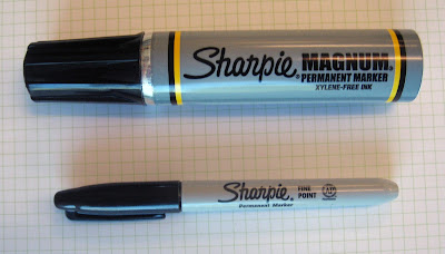
However --- At a recent design charrette, Mike Taylor, AIA of DP3 Architects in Greenville whipped out the largest marker I  had ever seen -- the Sharpie Magnum. I was impressed and a little envious --  a typical male response. So, after the charrette I ordered a few for myself. 

They are great markers -- if you remember to use them in a well-ventilated space. They are strong in the odor department.

They lay down a thick, very opaque line and have a huge ink reservoir. This is the pen for bold lines and bold ideas.

Draw big !!


Sunday, August 29, 2010

Parallel Gliders


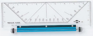
One of the most used pieces of equipment in our studio are parallel gliders. I think I am the only one who still uses a parallel bar but these little dealios are great for quick drawings and layouts by hand. The ones we use are made my Alvin but they come in a couple of models. The most common has a blue anodized roller bar. Mine has a silver anodized bar. There is also one model called a Rolling Parallel Ruler. I have the tiny 6" version of that to carry along but generally I think they track a little less true than the professional parallel glider.

This is what Alvin says aboutn them on their website: "An easy-to-use instrument that combines the functions of a parallel straightedge, triangle, protractor, T-square, and compass in one. One of the most useful and convenient aids for drafting, drawing, and nautical applications. Smooth gliding action to easily make parallel lines without twisting or turning under accidental pressure. Features durable acrylic blade with printed graduations, through-holes at ½" increments for drawing circles, and a comfortable aluminum roller bar with non-skid rubber O-rings for a firm grip on any surface. Available in both 10" and 14" lengths in metric and inch versions."

Saturday, February 20, 2010

How Kathleen Edwards Affected my Marker Preference


My first posting raved about the attributes of Copic pens. Copic also makes a pretty cool marker as well.

I'm sure I will be loyal to Chartpak AD Markers for all my breathing days. Their ability to blend, nib design, etc. are unrivaled by other markers -- in my opinion. Although limited, I like their colors too. After 20 something years I can also pick colors in my sleep. It seems architects have a preference for Prismacolor markers but I don't get it. Lots of colors but they don't seem quite as blendable, etc. to me. Of course, most architects will admit their marker rendering skills pale in comparison to the talents of the typical landscape architect. We rock at marker renderings. Thank you, Mike Lin.

I discovered Copic markers last spring when my good friend Jennifer and I went to Chapel Hill, NC for the Kathleen Edwards concert and decided to check out an art supply store the following day. I was drawn to their super wide markers (it's huge!) but also liked that the other two sizes had dual nibs. The color selection is way better than "basic" -- they offer 334 colors (compared to 130 for AD and 156 for Prismacolor).

The nibs are replaceable / interchangeable and there is even an airbrush attachment. I might have to try that out. They are a little more expensive than the other brands ($5.62 for copic wide, $5.09 for copic orignal, $4.87 for copic sketch, $3.19 for Pantone, $2.59 for Chartpak -- all at Dick Blick) so I still have a limited palette. Copics are refillable, which is a good feature. For $5.99 you can refill a sketch marker up to 10 times. This seems like a more sustainable approach. Although I guess it could be inconvenient and potentially messy.

So, there you have it: another rendering option. Try them out. Oh, and if you haven't heard her yet, give Kathleen Edwards a listen. I have been a fan since her first CD. You will love her. I promise. Her songs are awesome.

Wednesday, February 17, 2010

Tape Dots and The End of An Era

You know you are a geek when you have a preferred drafting dot brand. But you know you are a geek with “issues” when you are upset when you can no longer get your favorite dots.

For years, my favorite drafting dots were made by Charrette. Why? Were they really any different than Alvin or Staedtler Mars dots? No, probably not. Could I buy them locally like I could the other brands? No, I had to order them. So, why did I like them so darn much? Well, one reason was the name. We like charrettes so why not have a drafting dot that says charrette? Also, unlike some brands, the color didn’t seem to rub off on the paper when you stuck them.

But it is all a moot point because Charrette got bought out by some stupid big company who did not care about our loyalty and the store was shut down forever. I can’t find any of their dots online anywhere.

However, one day while eating lunch at my desk and googling for my beloved dots I ran across a new company: Haut Dots. Their web site was not even totally functional yet so I emailed them. I was very intrigued by their tag line: “Premium drafting dots for the preferred scheme.” So, I ordered a box of each pattern. They came in the mail and I am giving them a whirl. They are not the usual crepe-ish kind of tape material but a smoother white surface with crisp, slick, minimalist graphics in a line, cross, and circle pattern. Pretty cool. They sell them for $7.95 online which is fairly comparable with other “regular” dots (about a buck and a half more than Staedtler Mars dots at Staples). They seem to actually stick too, which is the main job of a tape dot.

By the way, I always took drafting dots for granted until I did a charrette at Clemson once and I caught the students assigned to our team cutting them into quarters with an x-acto knife to make them last longer. I also worked with a landscape architect years ago who stuck them on her drafting lamp to re-use later but they usually ended up stuck in her hair (without her knowledge, usually).

I will probably continue to use Staedtler dots for day-to-day stuff but I will use my new Haut Dots for the “preferred scheme”. I will probably also hoard my last remaining boxes of Charrette dots until they are finally gone. I am such a dork.

http://www.hautdots.com/index.html

Monday, February 1, 2010

Cool Pencil Case

When we started the urban edge studio everyone got one of these cool pencil cases, and a matching business card case. I got them at MoMA and they are made by a Japanese company called MUJI.

The full name of the company is Mujirushi Ryohin which translates as "no label, quality goods". This company tries to achieve, according to their web site, "a simplicity achieved through a complexity of thought and design". I am drawn to their simple aesthetic and the quality of their products. Simple is good.

The cases are very lightweight aluminum. They measure about 6.75" x 2.5" x 0.5" and hold about 12 pencils or a slightly less quantity of pens. They are proving to be very durable.

The colored pencils shown here are Derwent Studio pencils, which are surpassing Prismacolors for me as the colored pencil of choice. I must say, however, that unlike some of the others in my studio, I am still much better at marker renderings than colored pencils. They have their place, however.


Friday, January 22, 2010

When Size Matters (image is clickable)

Since my last blog was about what I consider my best mechanical pencil (the rotring 600) this one is about my biggest mechanical pencils -- or more technically -- lead holders. One is called The Chubby. This is a contender for the ultimate "big idea" charrette pencil -- it's like using a sharpie that can be erased. It lays down a big fat line when precision does not matter but boldness does. It has a round barrel in a sleek matte gray.

It also comes with leads in various colors (red, green, blue, pink, brown) in addition to a nice soft black lead. This pencil is supposed to have a sharpener in the end cap but for some reason it was missing in mine. Hmm. I was a little miffed about that at first, out of prinicple, but I doubt I would have actually used the sharpener. That is, quite frankly, a problem with buying on-line. Returns are a pain in the butt.

It comes in a fancy little padded tin, which probably is the reason it costs more than the Cretacolor pencil. About twice as much.

So, when you need to lay down some bold lines to convey those big ideas you can't do much better than whipping out your Chubby. Unless it is the Cretacolor 430 02 -- 5.6 mm lead holder -- a perhaps slightly more serious version of the Chubby. And this one does have a lead pointer in the cap. This hefty, solid metal tool comes from Austria. It is a serious pencil. For serious doodling.

The Chubby is available at Paper Source. I think that is who I ordered from. Cretacolors are hard to find too. I bought my Cretacolor in a store in Seattle a few years back.

http://www.paper-source.com/cgi-bin/paper/item/Chubby-Mechanical-Pencil/3907.010/444672.html


http://www.xonexpens.com/products/categories/pencils/chubby.htm

Saturday, January 16, 2010

the best pencil ever

If I had to pick one pencil to write with for the rest of my life it would be the Rotring 600 in a .7mm.

This is the ultimate mechanical pencil. It has a shaft made of solid brass which gives it really good heft and balance. It has a hexagonal profile – like a wooden pencil. It rarely jambs and is easy to take care of and refill.

They were available in both a silver and black finish. Both of mine, as you can see, are silver.

All of them have the distinctive ‘red ring’ around the top of the shaft – near the rotating lead hardness indicator. ‘Rot Ring’ is German for ‘Red Ring’. I bear down pretty hard so I break the .5mm too often so I stick with the .7mm. The earlier pencils said ‘rotring 600 /’ followed by the point size. Newer ones just had the point size. I have one of both.

Unfortunately, the Rotring company was bought out by Sanford which is a subsidiary of Newell Rubbermaid and this model has been discontinued. Go figure.

It can be found on a few websites and also on ebay.


Prices typically range from $60 to $80 depending on if they are new or used. I paid a very reasonable price for my first one but the second one was purchased after they started becoming hard to find. I hope I never feel a need to buy another one. That’s like the price of a week’s groceries.


For a while (not sure they still do) they made something called a rotring ‘Core’ which was a weird stubby rubbery thing. Obviously, this was part of the growing pains of the buyout. Huge mistake. Why did they think those were good but got rid of their classic? What were they thinking? To me, raving about the Core would be like thinking a Mustang II was cool.


They still make a pencil called the rotring ‘tikky’ which is very inexpensive but looks like a decent pencil. I don’t own one. I might give one a try sometime. So, if you can find (or decide to be extravagant and actually buy) a rotring 600 you will not be disappointed.


Just keep your hands off mine, please.

Monday, January 11, 2010

Dead Trees and Future Landfills

File Folders have to be one of the most mundane things in most offices, next to staple pullers. They are usually that very blah manila color (when I was a kid I thought they were called vanilla folders). Occasionally, people branch out into colors but those are right out of the box of 8. Not very inspired.

But then there are the folders made by Knock Knock. (www.knockknock.biz)

These guys have folders in great colors with bold text that say things like: "Dead Trees", "Future Landfill", or "Wasted Paper". Or even bolder ones with things like "Useless Documents to Provide Appearance of Importance in Meetings" or "Papers to Shuffle Endlessly Thereby Accomplishing Nothing".

They also make post-it notes with similar things to say about the sometimes pointless, fruitless, brain-numbing things that get in the way of the fun stuff at work. Actually, every product they make is geared toward making 9 to 5 more fun.

So, can file folders be part of the "Good Things That Make Designing More Fun"? When they are as irreverant as these -- heck yeah!

Sunday, January 10, 2010

Still On The Grid


Ask anyone in my studio -- I am the source for all things "old school". Need an ellipse template? Go see Bill. Need a bar compass? Go see Bill. Need a little erasing shield?
Yeah, you get it.

It is a collection that has been amassed over many years. This is true for a few reasons: 1) I am by far the oldest person in the studio as none of the others have escaped their 20s yet. 2) I never throw anything away. Well, rarely, anyway. 3) I still appreciate the "old school" approach to designing. A thick pen in your hand; a roll of trash; a scale. Yeah, that’s a good time.

This leads me to wonder how many things have been designed and built over the years simply due to the arc of a grand stroke that was the radius of elbow to pencil tip. Also makes me think of the time Robert Marvin told me it was time for me to “stop designing with a pencil and start designing with your mind”.

So, for most of my career these “tools of the trade” have been hung (somewhat neatly) on two black plastic covered grids with plastic hooks on them. I got them at The Container Store in Dallas, TX way back in the early 80’s. I don’t think they are available like this anymore. Well, not in black. They still have a similar product in white. They have a similar product in metal too. Nice.

Anyway, the next time anyone in the studio needs a flexible curve they know exactly where to find it.

Wednesday, January 6, 2010

the kaddy. for real.

I am, I freely admit, a pen geek. I love pens. Thick ones. Thin ones. Black. Red. Green. But mostly black.


I am fickle though. Today I might be loyal to micros and tomorrow I am all about staedtlers. right now (see previous blog) I am loving some copics.... go figure.

I am most at ease when surrounded by them. So, I never like to not have a handful of them nearby -- just in case I get the urge to sketch or doodle or make a grocery list or something.

I have found the perfect little pen caddy. it is actually called a kokuyo kaddy. When you unzip it and fold down the sides it will stand up-right. well, most of the time anyway. It holds about 60 pens or pencils and has a little velcro thing in the top to hold spare leads, etc. I have two of them in my timbuktu right now -- both filled to capacity pretty much.

Of course anyone who loves pens must love sketchbooks. That is another subject for another time.

Bill.

PS -- My one pet peeve: Put the caps back on when you're done!!! Please.

mistakes? well, sometimes

there are those among us who never make mistakes. at least that is what they would have us believe.

they do, however, probably need to at least erase their guidelines. right? as for me -- I make lots of them. or at least I change my mind from time to time.

so, a good eraser is a must. I have an electric one but it's loud and always reminds me of the dentist office which makes me freak out a little and you can't draw with clammy hands. or the shakes (unless its a very conceptual sketch then shakes are just 'technique'). this is my favorite eraser -- simply because it already says what I usually say when I make a mistake. "holy crap!" there is another one that just simply says "oops." I like it too. a bit more subdued for those minor goofs and smears.

actually, these are really nice soft erasers that leave no smudges or residue. and they fit your hand well. the only place I have found them is paper source. I know there are stores in Atlanta and Alexandria, VA but you can also get them on-line.

and if you aren't making mistakes you are making a big mistake -- playing it too safe!

Bill.


p.s. -- I like kneaded erasers too and found some (faber castell?) that come in red, yellow, and blue which I like better than that typical nasty looking gray.

Tuesday, January 5, 2010

this is the first post

what things do you use in the office or at home that make designing more fun? where does your geekyness show itself? pens? pencils? sketchbooks? file folders? paper clips? with this blog I will highlight the things I love to have around when I am designing --- Good Things That Make Designing More Fun.

the first one is the Copic Multiliner SP pen. they feature a durable aluminum body and feel good in your hand. the ink is waterproof and pigment based, providing a consistent ink flow that makes drawing "more fun". they work great on trash paper and heavier stock as well. the really cool thing is all Multiliner SP pens are refillable and have replaceable nibs. so, for a couple of bucks its like having a new pen. they come in 9 point sizes from .03 to .70 and a brush.

they are available at lots of good art stores but I usually get mine at Sam Flax in Atlanta. Enjoy.